Logo Design * Logo Artist * Logo Samples * Tutorial on Logo Design * Illustrated Logo Types

|
|
Logo Design * Logo Artist * Logo Samples * Tutorial on Logo Design * Illustrated Logo Types |
||||||||||
|
|
|||||||||||
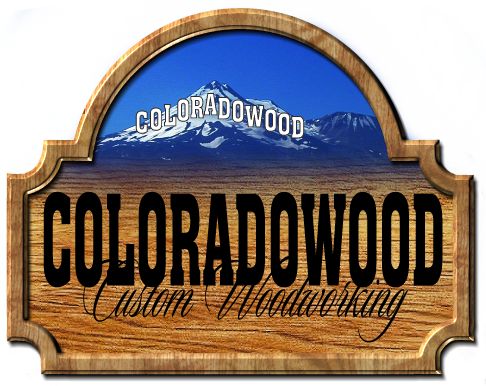
| Now comes the text of the logo. I used the same font as the white lettering on the mountain for the main bold text of the name, but I condensed the lettering a little to fill the space a little better. Next I wanted a contrasting font or type face to spell out the "Custom Woodworking" part of the logo. I got the basic layout of the text like I wanted it and was ready to move onto the lettering effects for the logo. | |||||||||||
|
|
|||||||||||
 |
|||||||||||
|
|
|||||||||||