
Minimalist design has evolved far beyond “empty space and white backgrounds.” Today’s best minimalist websites balance clarity, performance, and emotional impact while still feeling high-end. The difference between “too simple” and “quietly premium” often comes down to typography, spacing, motion, and content hierarchy—not decoration.
Below are 10 websites that demonstrate how minimalism can still feel powerful, modern, and unmistakably premium.
1. Apple — Precision-Driven Minimalism
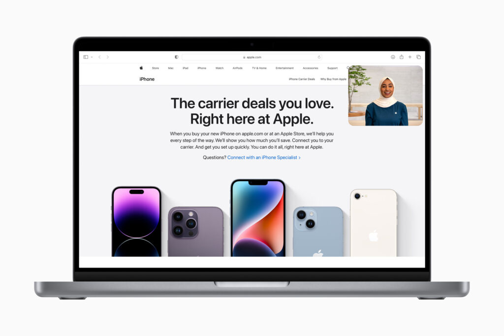
Apple’s website is a masterclass in controlled visual hierarchy. Every page is designed to guide attention with absolute precision.
Why it feels premium:
- Large-scale product visuals with minimal surrounding clutter
- Strong typographic contrast and consistent spacing systems
- Seamless scroll-based storytelling
Key UI takeaway:
Minimalism becomes premium when every pixel feels intentional. Apple avoids decorative noise and instead lets product imagery do the emotional work.
2. Stripe — Structured Simplicity with Depth
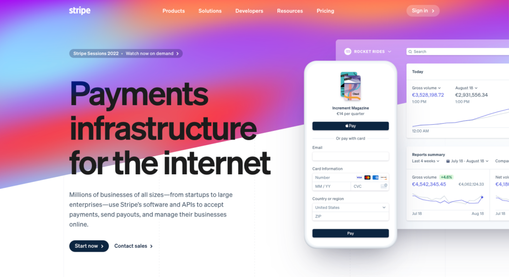
Stripe demonstrates how minimalist design can still feel technically sophisticated without overwhelming users.
What stands out:
- Clean grid systems with layered content sections
- Subtle gradients and soft color transitions
- Heavy reliance on typography hierarchy for clarity
UI insight:
Minimalism doesn’t mean flat. Stripe proves you can introduce depth through spacing, structure, and restrained color usage.
3. Airbnb — Emotion Through Simplicity
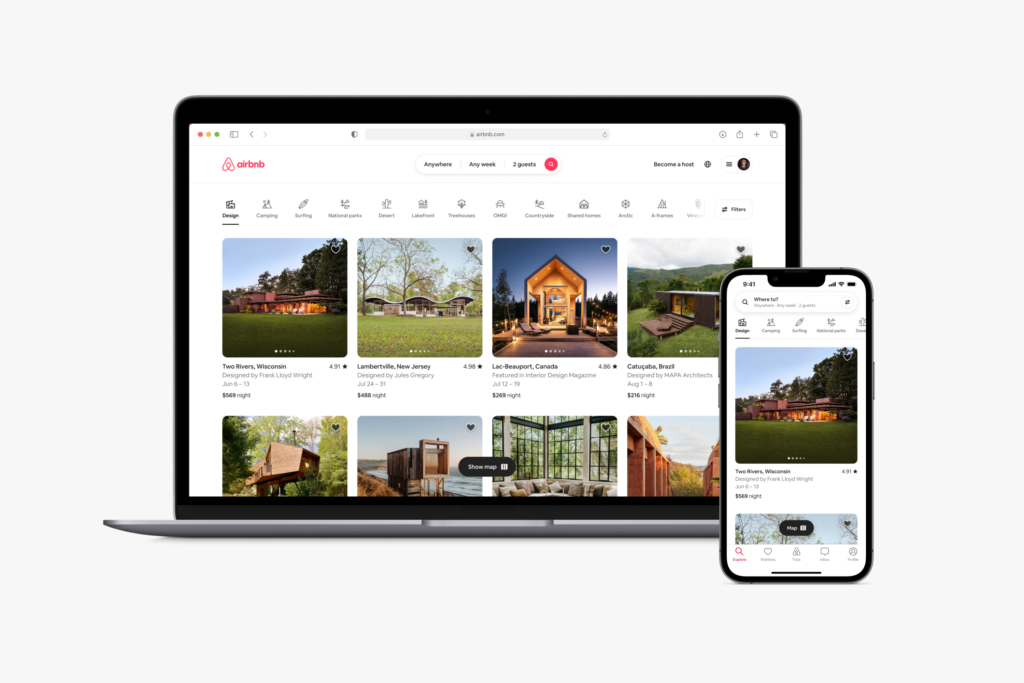
Airbnb blends minimal UI with strong emotional storytelling. Its interface remains clean while still feeling warm and human.
Design strengths:
- High-quality imagery dominates without clutter
- Simple navigation focused on search intent
- Balanced use of whitespace for calm browsing
Key takeaway:
Minimalism works best when paired with emotionally rich visuals that carry meaning on their own.
4. Notion — Functional Minimalism
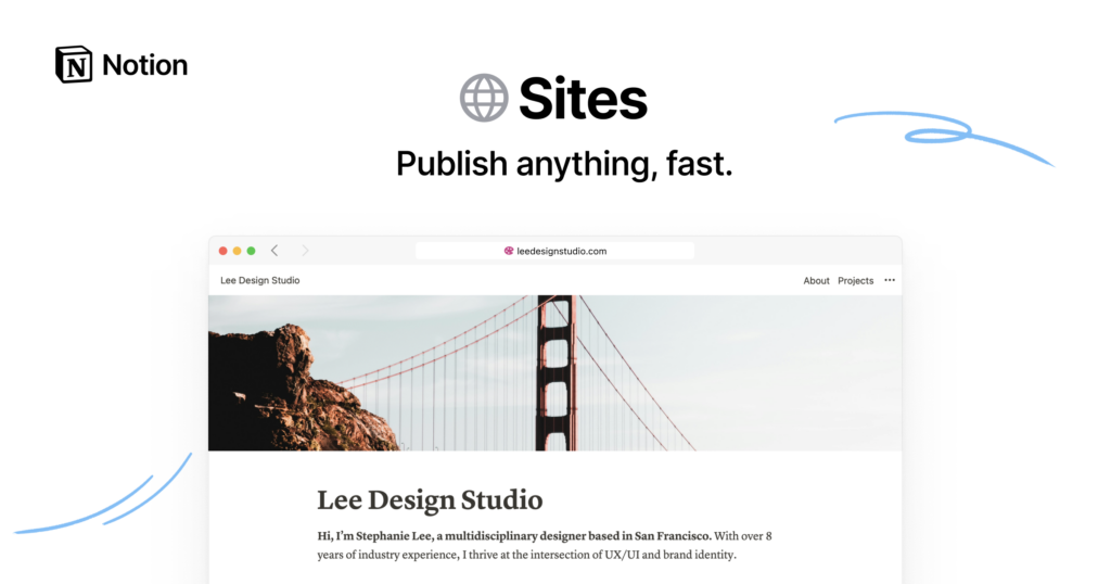
Notion’s interface shows how minimal design can still support complex functionality without feeling overwhelming.
Why it works:
- Neutral color palette reduces cognitive load
- Modular blocks make structure feel intuitive
- Consistent spacing creates visual rhythm
UI insight:
True minimalist UX is not about removing features—it’s about organizing complexity so it feels invisible.
5. Dropbox — Calm Corporate Minimalism
Dropbox has shifted toward a more editorial, minimal aesthetic that focuses on clarity and brand trust.
Key features:
- Generous whitespace and soft color backgrounds
- Simple illustrations instead of heavy visuals
- Clear, digestible messaging blocks
Design lesson:
Minimalism builds trust when users never feel rushed or visually pressured.
6. Tesla — Product-Led Minimal Storytelling
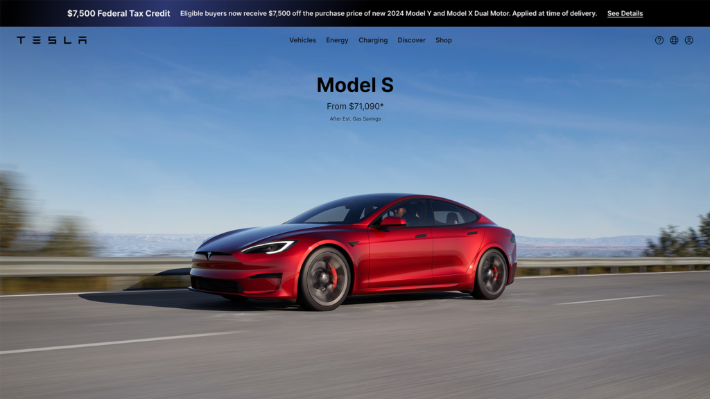
Tesla’s website is extremely product-focused, with minimal distractions from its core message: the vehicles.
What defines its UI:
- Full-screen imagery with minimal text overlays
- Linear scrolling experience
- Strong focus on specifications without clutter
Insight:
Minimalism is powerful when the product itself is visually compelling enough to carry the interface.
7. Muji — Philosophy of “No Design”
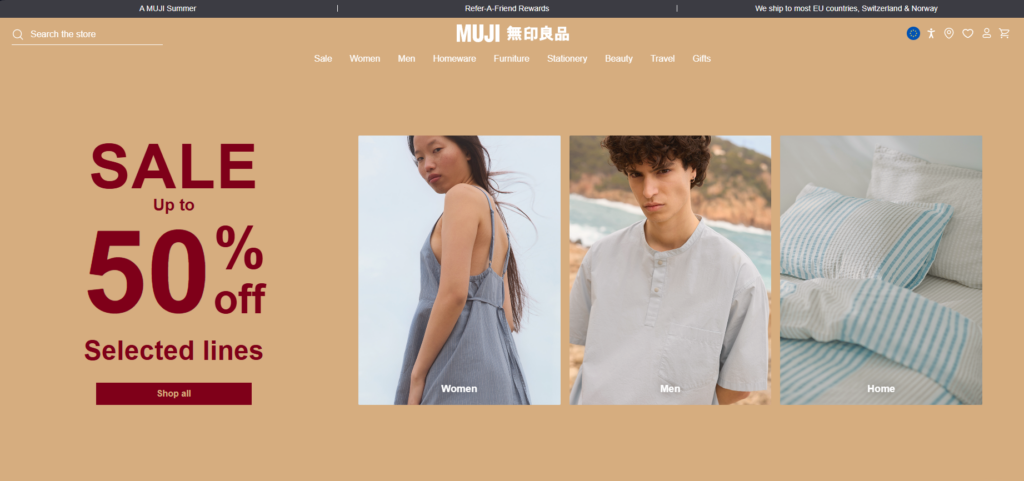
Muji’s digital presence reflects its physical brand philosophy: simplicity, function, and absence of excess.
Design principles:
- Neutral colors and restrained typography
- Product-first layout structure
- Emphasis on utility over decoration
UI takeaway:
Minimalism can be a brand identity, not just a design choice. Consistency across all touchpoints reinforces premium perception.
8. Linear — Modern Developer Minimalism
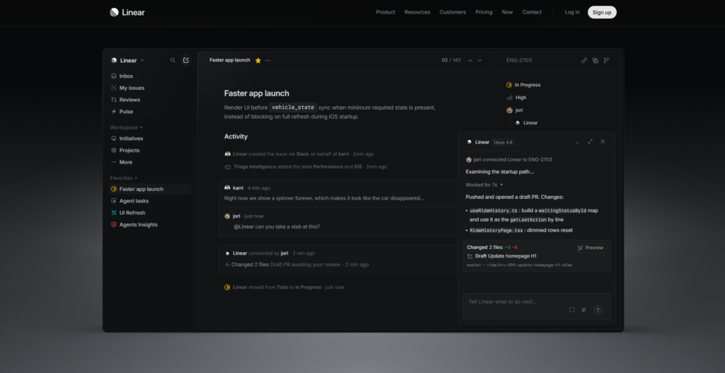
Linear represents a new wave of software UI: fast, sharp, and visually restrained but highly polished.
Why it stands out:
- Dark, refined interface with subtle contrast
- Instant-feeling interactions and transitions
- Dense information presented with perfect alignment
Key insight:
Minimalism in SaaS works when performance and visual clarity feel inseparable.
9. Figma — Clean Interface for Complex Creativity
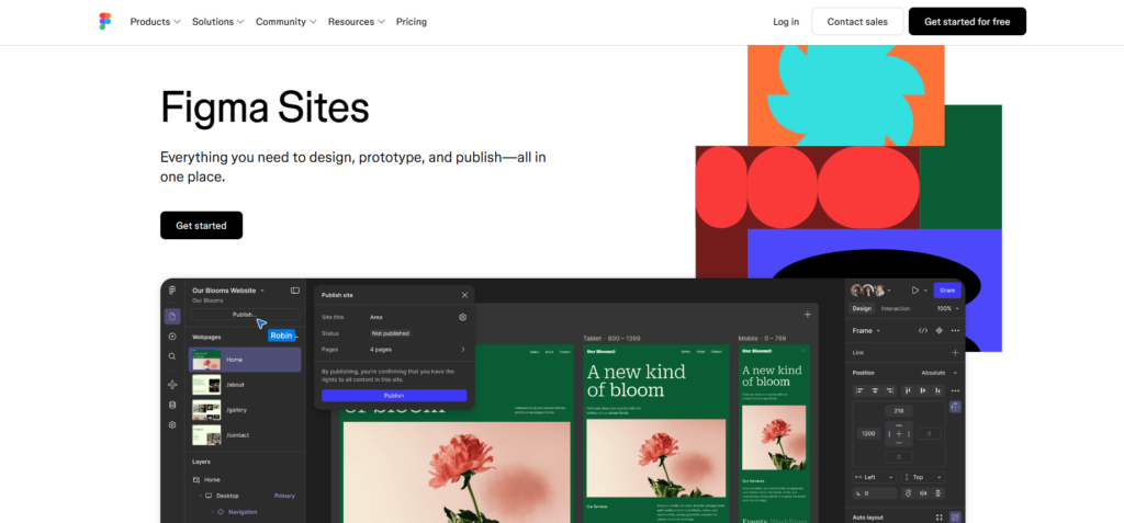
Figma manages to feel minimal while supporting highly complex collaborative design workflows.
UI highlights:
- Soft interface colors that fade into the background
- Highly structured tool placement
- Smooth interaction feedback without visual overload
Design takeaway:
Minimalism should never limit power users—it should reduce friction so creativity feels effortless.
10. Squarespace — Template-Based Elegance
Squarespace builds its brand around minimal, elegant website templates that emphasize visual storytelling.
Core design strengths:
- Strong use of typography-driven layouts
- Clean grid-based templates with balanced whitespace
- High-quality visual demos showcasing real-world usage
UI insight:
Minimalism becomes scalable when it is systemized into reusable design patterns.
What Makes These Minimalist Websites Feel Premium?
Across all these examples, premium minimalism is not about removing elements—it’s about refining them.
Shared design principles:
- Strong typography systems — Clear hierarchy replaces visual clutter
- Intentional whitespace — Space is used as a structural element
- High-quality imagery — Visuals carry emotional weight
- Subtle motion design — Micro-interactions enhance feel without distraction
- Consistent grid systems — Alignment creates subconscious order
Key Lessons for Designers
1. Minimalism is not absence—it’s control
Every element must justify its presence visually and functionally.
2. Premium feel comes from restraint
Luxury interfaces often avoid over-designing in favor of clarity and spacing discipline.
3. Content hierarchy is everything
Users should instantly know where to look without thinking.
4. Emotion still matters
Even the cleanest UI needs warmth—usually delivered through imagery, tone, or motion.
Final Thought
Minimalist web design continues to dominate modern UI trends because it aligns with how users actually interact with digital products: quickly, selectively, and visually.
The most successful minimalist websites don’t try to impress with complexity—they impress by removing everything unnecessary and making what remains feel inevitable.


